







Bria Insights: AI early-warning on at-risk learners, attendance drift and fee default

+$2.96/mo at 500 students. Free instant access, no credit card required.

Works with
  • Academics
Bria Insights in the EduPrime: AI early-warning on at-risk learners, attendance drift and fee default
01

The shortlist — and the arithmetic behind it

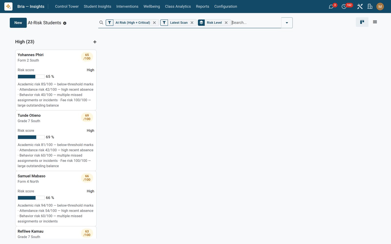
Enrolled students are scored out of 100 from four components: academic (100 minus the average mark percentage, plus a 20-point penalty when the latest term fell more than 15 percent below the one before), attendance (the share of sessions in the rolling window marked absent or late), behaviour (10 points for every homework left pending, late or missed, 20 for each boarding incident, capped at 100) and fees (outstanding balance over total billed). Weighted together they place the student in low, medium, high or critical at 40, 60 and 75. The board opens grouped by risk level with high and critical already filtered, each card carrying the score bar and the reason in one line; Risk Analytics is a report holding exactly one latest row per student, ready to pivot by class, year and level. A student with no marks, no attendance, no incidents and no balance is skipped rather than recorded as a false zero.
Bria Insights: The shortlist — and the arithmetic behind it
02

Nothing you cannot audit, nothing you cannot re-run

The four weights — 0.35 academic, 0.25 attendance, 0.25 behaviour, 0.15 fees out of the box — the rolling window in days, the engagement threshold and the absence-rise trigger all live in Settings, and the engine re-reads them on every single run: change one, and the next scan uses it. Every score carries a calculation breakdown showing component times weight equals contribution down to the total, and that same block prints on the student brief, so a disputed number can be walked through with a parent. Recompute All Now re-runs any of the ten scorers on demand and prints a result panel naming each one and the row count it wrote — and the panel still shows that report the next time you open the wizard, so anyone can see when Bria last ran. Eight scheduled checks ship switched on, so the risk, cohort, wellbeing, trend, forecast, engagement and heatmap tables refresh without anyone opening the wizard; career suggestions is the one scorer that never runs on its own, and it stays unticked by default because it walks every mark in the school. A manager-only Recompute Risk Now button sits on the class form and fires a full rescan plus a cohort refresh without leaving the record.

Bria Insights: Nothing you cannot audit, nothing you cannot re-run
03

The flag that goes up before anyone asks for help

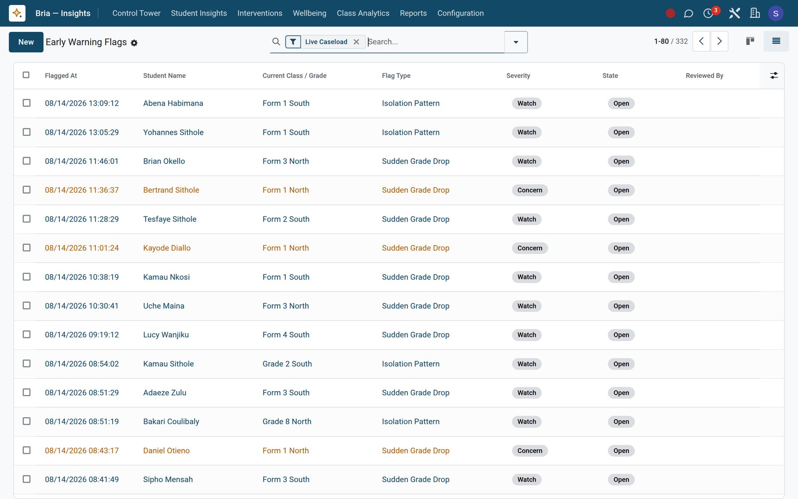
A daily sweep reads each student’s recent record and raises a flag on seven patterns: an absence rate that has climbed past your threshold against the previous 30 days and is now over 20 percent, erratic attendance that flips between present and missed three times or more, a grade average in the latest sitting that has fallen more than 18 percent below everything before it, repeat boarding incidents, a behaviour change read off the discipline register, an isolation pattern — nothing co-curricular on record alongside slipping attendance, and only for children old enough for the co-curricular programme, an age you set — and an engagement score that has dropped below 30 and 15 points month on month. Each flag records the figures that triggered it in plain English — “average fell from 63.4 percent across 37 earlier assessments to 52.0 percent in the latest sitting” — bands as watch, concern or urgent, and is never raised twice while one of its type is still open. The attendance-shaped detectors will not speak on fewer than six recorded sessions — a ratio with a denominator of three is an anecdote, not a rate. From there it moves open → under review (stamping who picked it up) → resolved or referred, with history and scheduled activities on the record, and one button turns a flag into a counselling intervention linked back to it. The board opens on the live caseload; clearing that one filter shows every flag the school has ever raised, closed ones included.

Bria Insights: The flag that goes up before anyone asks for help
04

Did it actually work? The record answers.

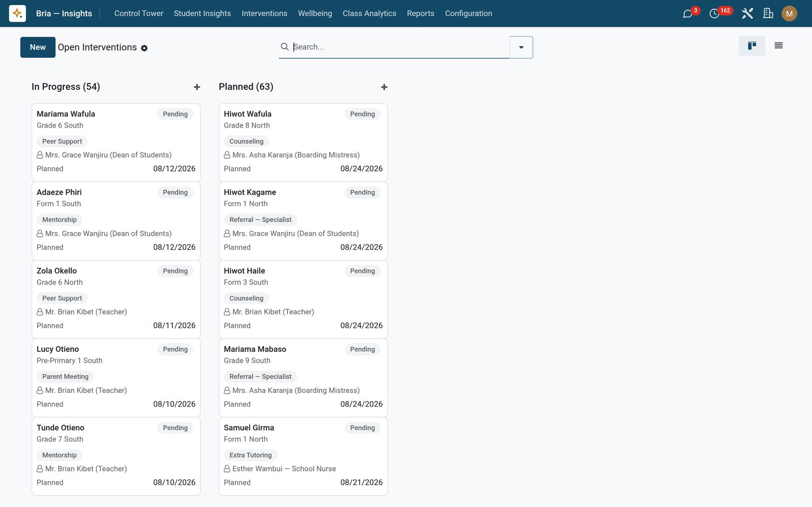
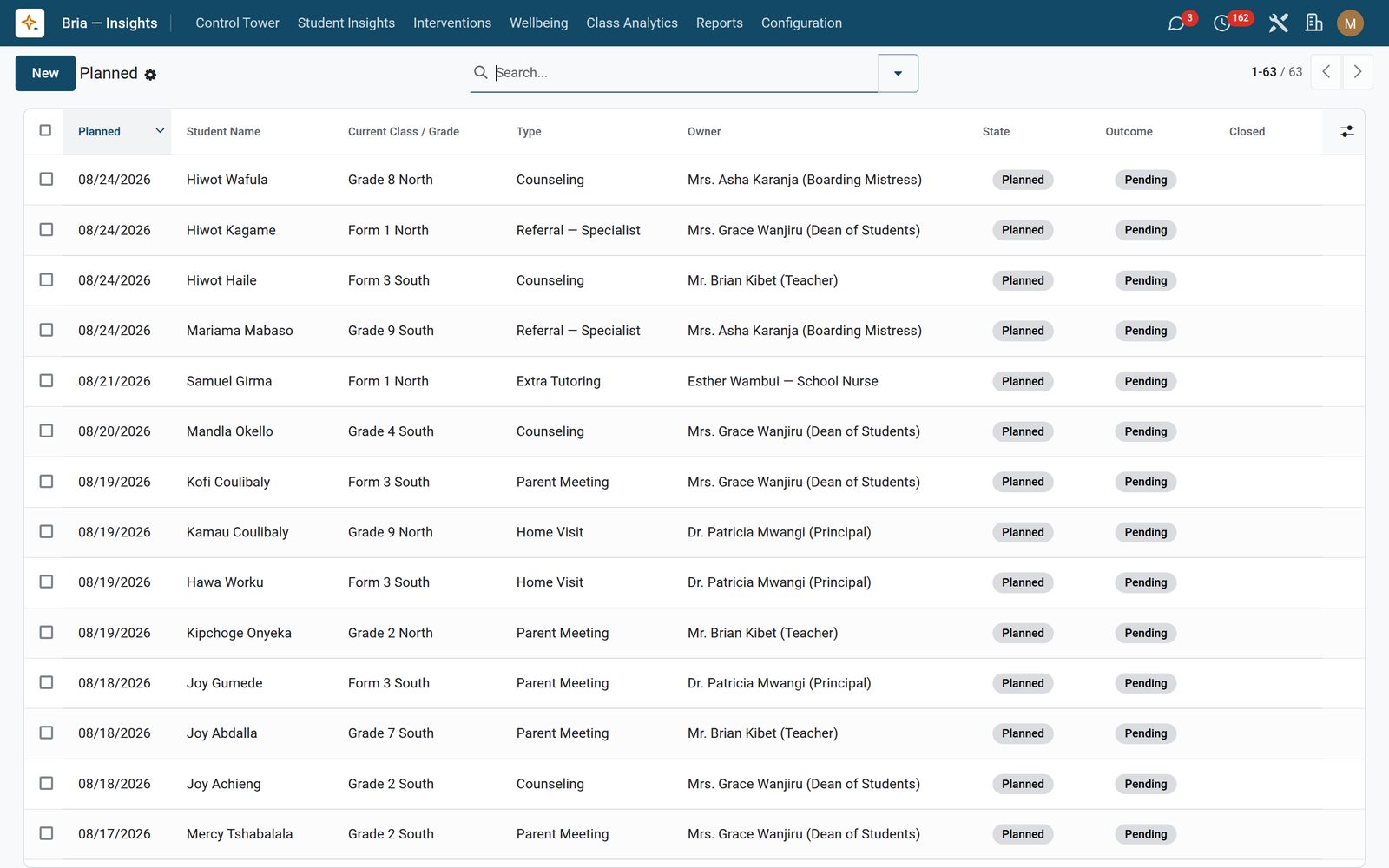
Log a counselling session, parent meeting, extra tutoring, mentorship, specialist referral, peer support or home visit against the student, with an owner, a planned date and an outcome of improving, no change, escalated or resolved. Press Capture Baseline and Capture Post-Score: the baseline is the last score computed on or before the planned date — so writing a case up a week late still gives you the number you started from — the post-score is the latest scan, and a fall of 10 points or more is marked a success on its own. Success Stories is the standing list of everything that cleared that bar, Effectiveness Review holds every completed case with baseline, post-score and delta side by side in the list itself, and the Intervention Effectiveness Summary PDF lays student, type, state, baseline, post and delta side by side for every intervention you select — the page you take to a board meeting when someone asks what the pastoral budget bought.

Bria Insights: Did it actually work? The record answers.
05

Which subject, which term, which direction

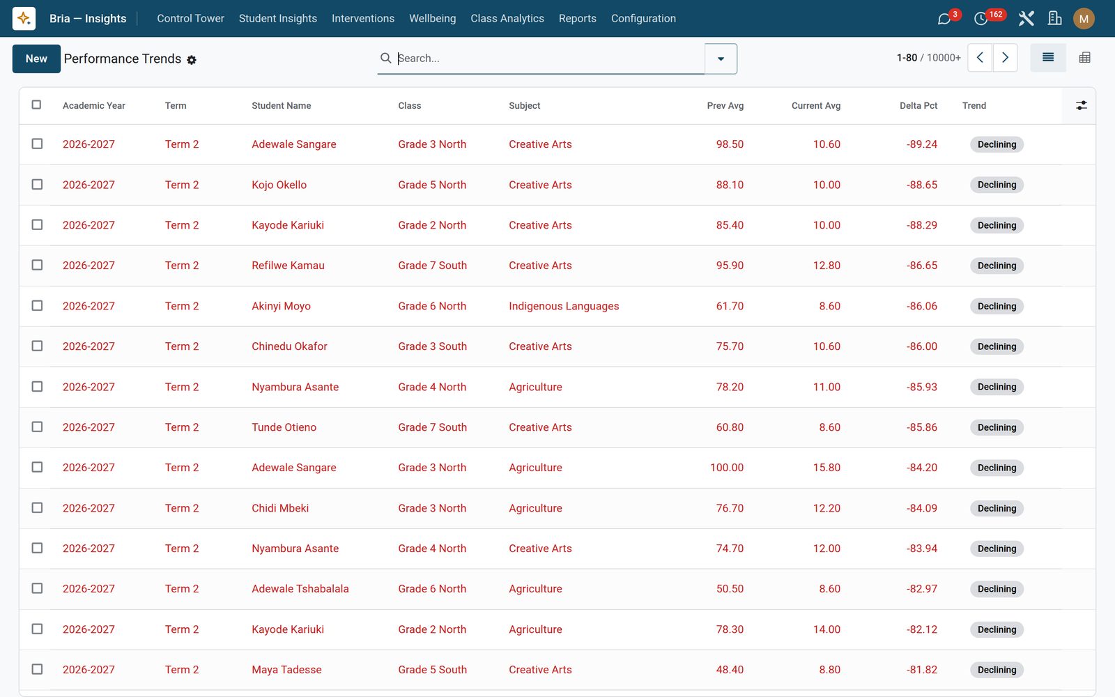
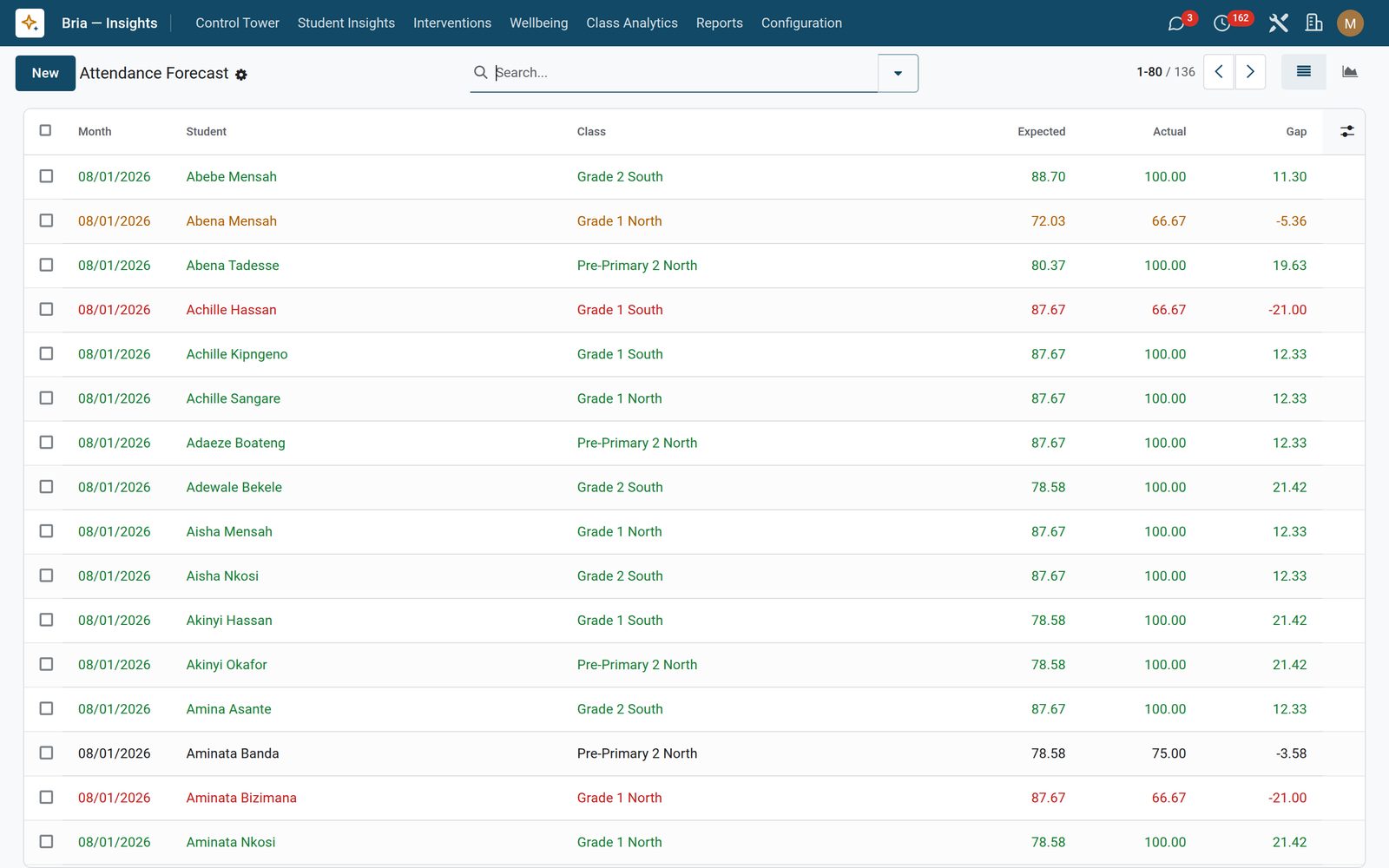
Performance trends keep one row per student, subject, term and academic year with the previous average, the current average, the change as a percentage and a badge reading improving, stable or declining at plus or minus 5 percent. The list opens with the steepest falls of the current term at the top, and a pivot of subject against term is one click away, so a cohort sliding in one subject is impossible to miss. The two averages either side of the change are like for like — one sitting against the sitting before it, not one paper against the mean of four. Attendance forecast takes each student’s own present-rate over the six months BEFORE the month being judged as the expected line, pulled toward the school’s rate until that student has a long enough register of their own, sets every month of actuals against it — a month is judged only where the child has at least three sessions in it and at least three in the record behind it, so no row is scored against a baseline the child never built — and colours the gap: a month more than 10 points below that student’s own norm turns red, more than 5 amber. It is a baseline-versus-actual comparison on real attendance, not a guess about next term. Both tables rebuild every seven days, or on demand from the recompute wizard.

Bria Insights: Which subject, which term, which direction
06

The whole school on one board — red, amber, green

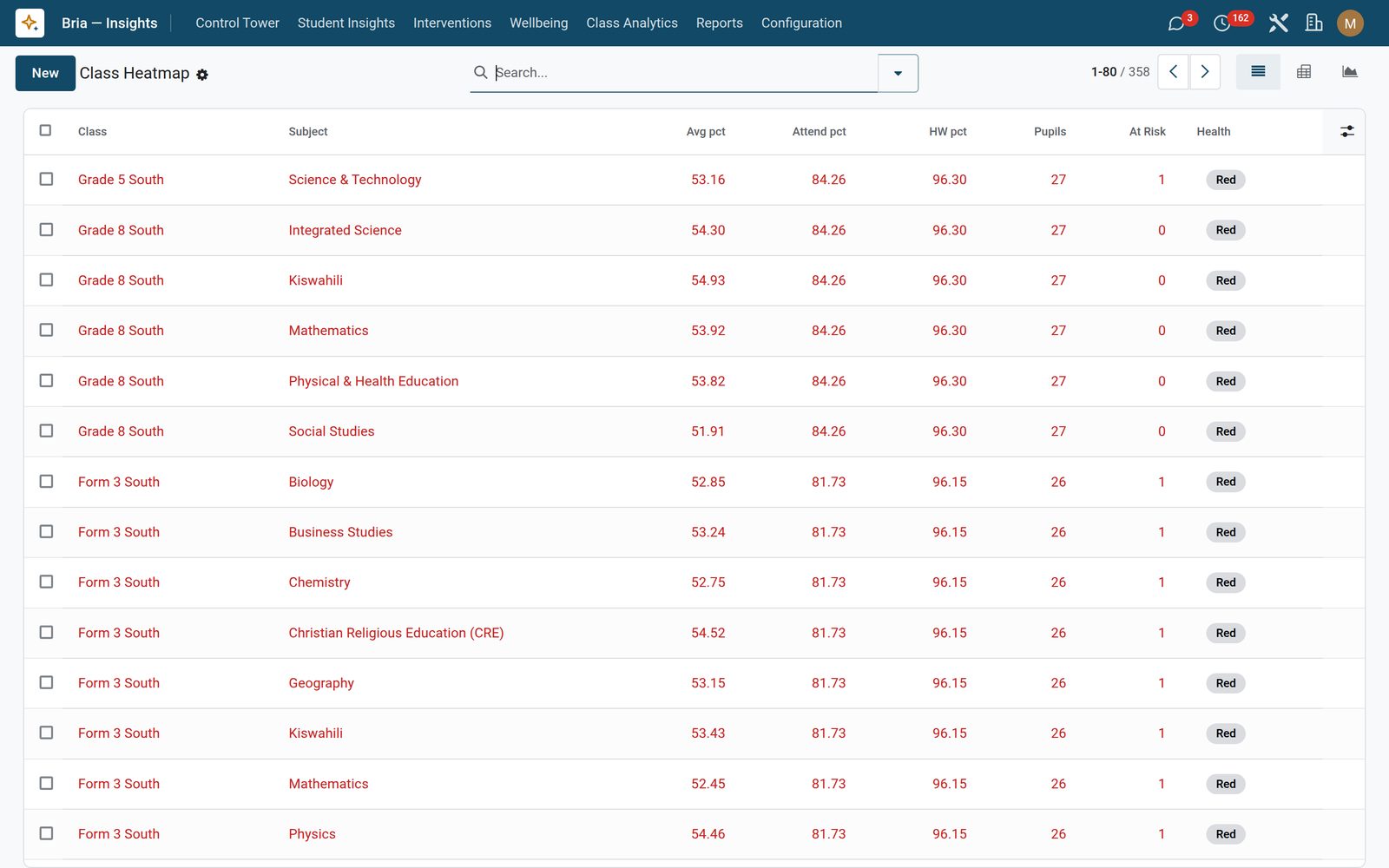
The heatmap builds one cell per class and one for every class-and-subject pair that has marks: average mark, attendance rate across the window, students enrolled and students sitting at high or critical risk. Three signals decide the colour — an average under 55, attendance under 85 percent, or more than a fifth of the class at risk. Two of them turn the cell red, one of them (or an average under 65) turns it amber. It opens as a colour-banded list with the red cells first, and a pivot of classes against subjects is one click away so a weak pairing shows up as a single dark square. Cohort insights add the strongest and weakest subject per class, the at-risk and critical counts, the class attendance average and the class average of the academic risk component — which runs the opposite way to the heatmap average, and is labelled Academic Risk on the column so the two cannot be read as the same number. And because the whole set is one flat table, the same cells come out as a list, a bar graph and a colour-banded Class Performance Heatmap PDF without you rebuilding anything. Teacher load is the fourth screen here and ships switched off, because workload figures are HR-sensitive: a per-teacher, per-month record of classes, subjects and students taught, marks entered per week, at-risk students inside that load and a burnout band, with its own red-and-amber PDF.

Bria Insights: The whole school on one board — red, amber, green
07

Is the adult side of the equation showing up?

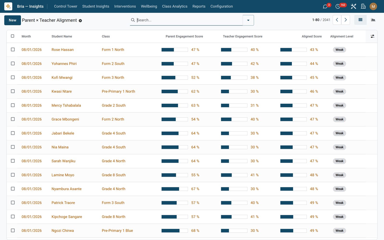
One row per student per month, and both halves are plain arithmetic you can check. The parent score is the supervision the school can actually observe: 45 percent the share of the month’s register the child was present for, 35 percent the share of the work set that came back, 20 percent the share of the fee bill settled, plus 7.5 points for each parent meeting completed that month, capped at two. The teacher score is what the class received: 45 percent marks sat per enrolled child, 30 percent homework set, 25 percent homework actually marked. A component the class does not keep — an early-years class holds no mark book — is dropped and the rest reweighted, never scored zero, and both sides are pulled toward the school’s own figure for that month until there is enough record behind them to speak for themselves. The average of the two bands as strong, adequate, weak or critical against a threshold you control, the board opens with the weakest alignment first, a line graph tracks it month by month, and one-click filters pull out low parent engagement and low teacher engagement separately — because “the child is disengaged” and “nobody has entered a mark for that class in five weeks” are very different problems. A score that drops below 30 and 15 points month on month raises a wellbeing flag on its own.

Bria Insights: Is the adult side of the equation showing up?
08

Careers, cutoffs and bursaries for the leaving class

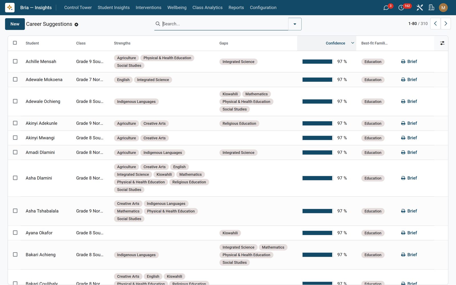
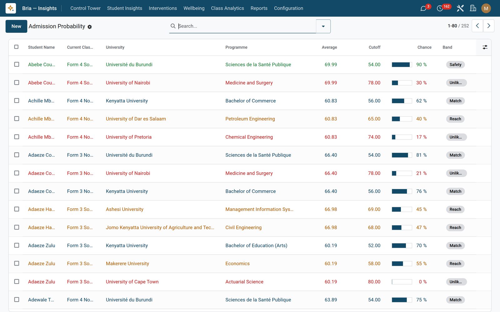
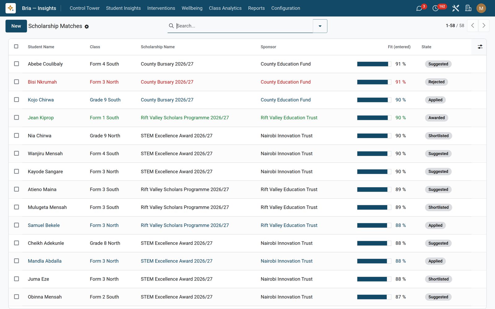
Ten career families ship ready to use — STEM, Humanities, Business, Arts, Medical, Social Sciences, Engineering, Law, Education and Agriculture — each with its subject weightings, typical careers and typical degree paths, all editable, and you can add your own. A career suggestion reads every mark a student has, tags subjects averaging 70 percent and over as strengths and under 50 as gaps, matches the strongest against the families and writes a printable Career Path Brief; its confidence figure measures how much mark data stood behind the suggestion, not how sure anyone is about the student. A family is only offered when the student actually sits most of the subjects that family is built on, and when none of them fits the brief says so and names the student’s best subjects instead — there is no least-bad recommendation. Admission probability is deliberately simple and says so: enter the target university, programme and its published cutoff, and the job maps the distance between the student’s average and that cutoff onto safety, match, reach or unlikely with a paragraph on what would close the gap; the board reads as a cohort with all four bands on it, and Needs Attention is the one filter that pulls out the reach and unlikely rows an adviser has work to do on. Scholarship matches is the shortlist and pipeline — suggested, shortlisted, applied, awarded — each row linkable to the real scholarship record in EduPrime Fees. All four screens stay hidden until you switch them on.

Bria Insights: Careers, cutoffs and bursaries for the leaving class
09

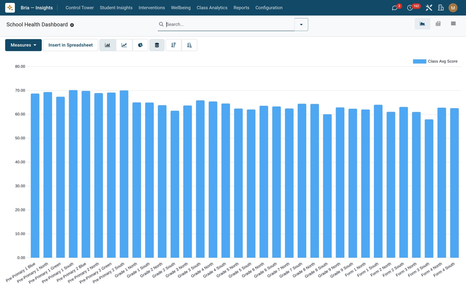
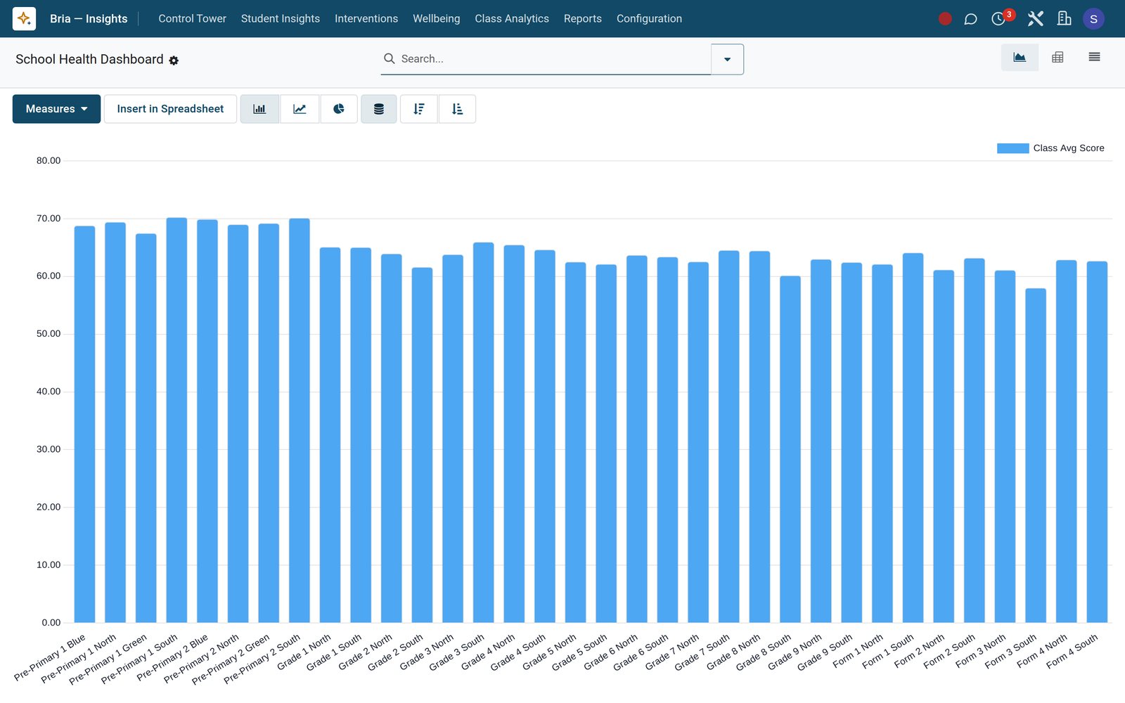
School Health Dashboard

Every class as a bar chart of its average, with the class-against-subject pivot one click away.

Bria Insights: School Health Dashboard
10

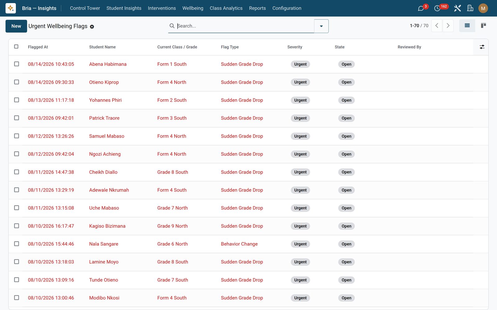
Urgent Wellbeing Flags

Wellbeing flags that need attention now: student, class, flag type, severity and who reviewed it.

Bria Insights: Urgent Wellbeing Flags
11

Admission Probability

Target university and cutoff against the student’s average, banded.

Bria Insights: Admission Probability
12

Scholarship Matches

A shortlist and pipeline you keep by hand: suggested, shortlisted, applied, awarded or rejected — the fit score is typed in, not computed.

Bria Insights: Scholarship Matches

What's inside

Everything in Bria Insights

55 items in 13 areas, every one shipping with the app today.

  • Student Insights

    • Performance Trends
    • Attendance Forecasts
    • Engagement Alignment
    • Career Suggestions
    • Admission Probability
    • Scholarship Matches
  • Interventions

    • Open
    • Planned
    • Effectiveness Review
    • Success Stories
  • Configuration

    • Settings
    • Career Families
    • Recompute All Now
  • Control Tower

    • School Health Dashboard
    • At-Risk Students
    • Urgent Wellbeing Flags
  • Wellbeing

    • Early Warning Flags
    • Under Review
    • Referred Cases
  • Class Analytics

    • Heatmap
    • Cohort Insights
    • Teacher Load
  • Reports

    • At-Risk Brief
    • Risk Analytics
    • Intervention Effectiveness
  • Bria — Insights

    • Interventions
  • Documents it prints

    • At-Risk Student Brief
    • Monthly Principal Report
    • Intervention Effectiveness Summary
    • Student Career Path Brief
    • Class Performance Heatmap
    • Teacher Load Report
  • It runs by itself

    • Bria · Daily Risk Score RecomputeRuns daily
    • Bria · Weekly Trend + Forecast RebuildRuns every 7 days
    • Bria · Daily Cohort Insight RefreshRuns daily
    • Bria · Weekly Engagement Score RecomputeRuns every 7 days
    • Bria · Daily Wellbeing Flag DetectionRuns daily
    • Bria · Monthly Teacher Load RecomputeRuns every 30 days
    • Bria · Weekly Class Heatmap RebuildRuns every 7 days
    • Bria · Monthly Admission Probability RefreshRuns every 30 days
  • Roles it ships

    • Bria Analyst
    • Bria Manager
    • Bria Counselor
    • Bria Board Member
    • Feature: University Admission Insights
    • Feature: Scholarship Matching
    • Feature: Career Suggestions
    • Feature: Teacher Load and Burnout Risk
  • Guided assistants

    • Bria · One-click Recompute All Scorers
    • EduPrime Adaptive Institution Settings
  • What it sends

    • Bria · Teacher Weekly Digest (At-Risk Students)
    • Bria · Principal Weekly Heatmap Digest
    • Bria · Board Monthly KPI Pack
    • EduPrime: Wellbeing Urgent Flag
    • EduPrime: Intervention Scheduled

Put Bria Insights to work

Add it to your EduPrime plan, priced per student, or start a free trial and see it running first.